
Adopting a Mobile-First Web Design Strategy: A Beginner’s Guide
Adopting a Mobile-First Web Design strategy prioritizes mobile device optimization over desktops or other larger-capacity environments, highlighting a strategic focus on enhancing user experiences where they most commonly occur—on mobile devices. This approach is essential as it tailors web development to cater to the majority who access the internet via their smartphones. In today’s fast-paced digital landscape, embracing mobile-first Web design is crucial for businesses, particularly for a leading digital marketing company in Australia like ours, committed to staying competitive and relevant. By focusing on mobile users, businesses ensure they are not just following a trend but are laying a foundational strategy for modern web development, essential for engaging effectively with the burgeoning mobile user base and maintaining a technological edge in the market.
The Critical Role of Mobile-First Web Design
As mobile devices increasingly become the predominant gateway to the internet, optimizing websites for mobile users is not just beneficial—it is imperative. Recent data indicates that, as of late 2022, mobile devices accounted for over 59% of global website traffic. This significant statistic underscores the shift toward mobile-centric internet usage, highlighting the importance of mobile-first strategies in web design.
The upward trajectory of mobile usage is poised to continue, with forecasts predicting that the global smartphone user base will surge to approximately 6.1 billion by 2028. This ongoing expansion emphasizes the future-oriented necessity of adopting a mobile-first approach.
Neglecting to prioritize mobile-friendly design can lead to a substantial loss of website traffic. Businesses that fail to adapt to this shift risk not only decreased user engagement but also a potential decline in overall website effectiveness, as a growing number of users may find non-optimized sites less accessible and harder to navigate.
The Essential Role of Mobile-First Web Design in Enhancing Your Business
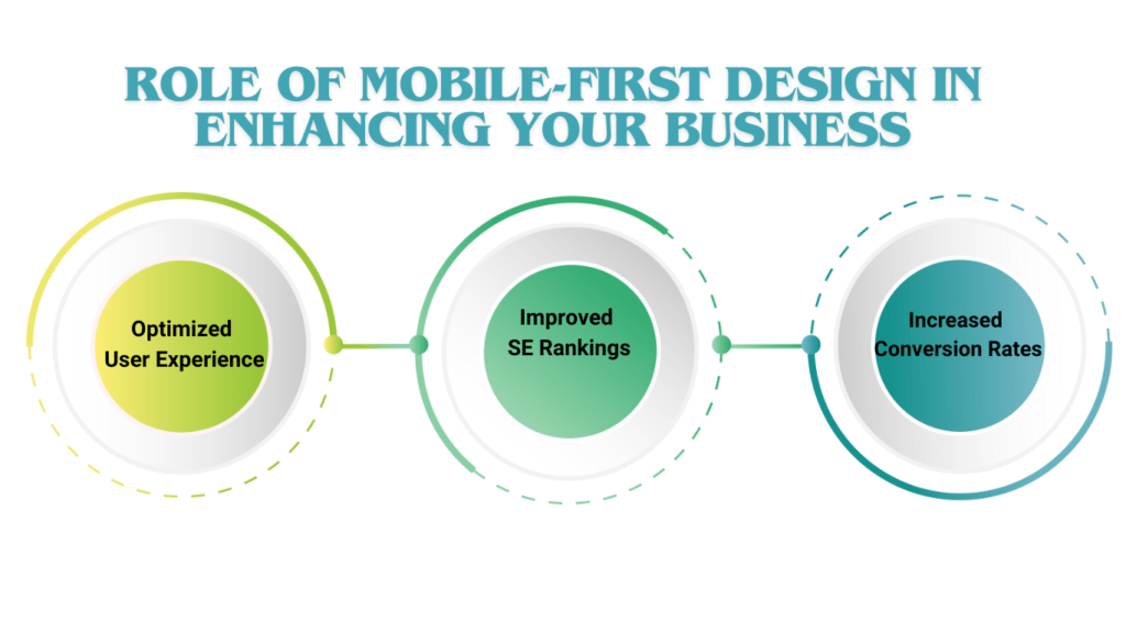
Optimized User Experience
Mobile-first Web design ensure that users on mobile devices have an optimal experience without the common drawbacks of scaled-down desktop sites. This focus on mobile usability enhances user satisfaction, which is crucial for customer retention and conversion rates.
Improved Search Engine Rankings
As SEO experts in Brisbane will attest, Google’s algorithm updates increasingly prioritize mobile-friendly websites. This means that mobile optimization is directly tied to improved search engine visibility. Websites that are mobile-friendly enjoy higher rankings, which can lead to increased traffic and greater organic reach.
Increased Conversion Rates
Data consistently shows that mobile-friendly websites see higher conversion rates. The reason is straightforward: when users find a website easy to navigate and interact with on mobile, they are more likely to make purchases or contact the business. Implementing a Mobile-First Web Design is, therefore, a strategic move to boost business outcomes through enhanced user interactions.
Best Practices in Mobile-First Design
Developing a mobile-first approach involves careful planning and meticulous implementation. Below are several key practices to consider:
- Streamlined Navigation: Simplify navigation to ensure that mobile users can find what they need without hassle.
- Responsive Interfaces: Design interactive elements to be easily accessible with fingers on touch screens.
- Optimized Content Placement: Place key messages and calls to action prominently to capture user attention immediately.
Leveraging Mobile-First web design for Business Advantage

Enhancing Brand Perception
A mobile-first website reflects a brand’s commitment to modernity and customer care. It sends a message that the business is forward-thinking and values user convenience, which can significantly enhance brand perception and loyalty.
Future-Proofing Your Business
With technological advancements and increasing mobile usage, businesses that adopt a mobile-first web design approach are better positioned to adapt to future trends. This foresight not only prepares businesses to meet evolving consumer demands but also sets them apart from competitors who may be slower to adapt.
Saya Solutions: Leading with Mobile-First
At Saya Solutions, we understand the significance of mobile-first web design in today’s web environment. Our expertise as SEO experts in Brisbane and our reputation as the top digital marketing company in Australia allow us to provide our clients with cutting-edge solutions that harness the power of mobile technology to grow their businesses.
Implementing Mobile-First Web Design: A Strategic Guide
Creating a mobile-first website is more than a technical task—it’s a strategic initiative that enhances user satisfaction and engagement. Here’s a structured approach to ensure your mobile site not only meets but exceeds user expectations:
Understand Your Audience:
Start by gaining a deep understanding of who your users are and how they interact with mobile devices. Analyze their preferences, browsing habits, and common devices used. This insight will guide the design and functionality of your mobile site, ensuring it aligns with user needs.
Strategize Your Content:
Identify the critical content and features most relevant to your mobile audience. Prioritize these elements in your design to facilitate easy access and seamless navigation. This prioritization ensures that users find what they need quickly, enhancing their overall site experience.
Select the Right Platform:
Choose a platform that supports responsive design and caters to your specific needs:
- For sites heavy on content, consider a Content Management System (CMS) like WordPress, known for its mobile-friendly themes and plugins.
- For customized solutions, frameworks such as Bootstrap or Foundation offer robust options for creating mobile-optimized sites from the ground up.
Design for Mobile First:
Begin your design process with the smallest screen in mind and expand outward. Focus on simplicity and readability, integrating touch-friendly elements to make navigation intuitive on touch devices.
Optimize Visuals and Media:
Reduce image and media file sizes to decrease loading times, employing responsive solutions and modern formats like WebP to ensure fast and fluid visual performance.
Implement Mobile-Friendly Navigation:
Adapt your navigation to suit mobile interfaces. Utilize user-friendly solutions like hamburger menus or collapsible accordions, which make it easier for users to browse your site on smaller screens.
Enhance Site Speed:
Avoid unnecessary coding bloat and plugins that could slow down your website. Utilize caching, Content Delivery Networks (CDNs), and code minification techniques to optimize your site’s speed and performance.
Test and Iterate:
Regularly test your website on various devices and browsers to pinpoint any functional or design issues. Employ tools like Google’s Mobile-Friendly Test to assess and refine your site’s mobile usability.
Continuous Improvement:
Mobile web design is not a one-time task but an ongoing process. Continuously monitor your site’s performance and user feedback to make necessary improvements, ensuring your mobile site remains cutting-edge.
By meticulously following these steps, you’ll develop a mobile-first website that not only caters to the current landscape but is also poised for future technological advancements, thereby driving improved user engagement, higher conversions, and enhanced customer retention.
Conclusion
The necessity for mobile-first web design in today’s digital ecosystem cannot be overstated. For businesses looking to enhance their online presence, drive engagement, and increase conversions, it is an indispensable strategy. As a leading mobile first website development service provider in Brisbane, we are committed to helping businesses across Australia realize the full potential of mobile-first design.
Select Your Next Read:
Identifying Unexplored Market Opportunities Through Competitor Analysis
Related Posts

From Chaos to Clarity: Transforming a Vague Website Idea into a Successful Project
Creating a website for a client who knows they need an online presence but isn’t…

WordPress 6.0: What’s New and How It Will Impact Your Site
Introduction: WordPress 6.0 brings a host of new features and improvements designed to enhance the…

Establish and Nurture an Online Presence
Author: Vibhuti Verma Published:18th Aug’23 Online Presence We are in a digital era in which…